How to Use the Form Creator

Overview
Welcome to our tutorial on the Form Creator in the Student Management System (SMS). This powerful tool allows users to create customised Enrolment Forms and Waitlist Forms, making it easier to collect the information needed from prospective students and allow interested individuals to join the waitlist for upcoming groups or groups that have reached full student capacity.
 NOTE: This exclusive feature is only available for Performance Package (formerly Maximise) and Compliance Plus subscribers. Unlock the full potential of your SMS with Performance Package and Compliance Plus packages. To upgrade your plan and access this feature, please contact our Support team.
Form Creator Layout and Features
There are four (4) main sections in the Form Creator: Controls, Designer, Page Settings and the Control Settings.
1. Controls
The Controls section is where form elements can be dragged from then dropped into the Designer section
- Card - A container with borders and a label to divide fields into sections. Other Controls can be dragged inside a Card. Cards can also be inside other Cards.
- Field - used for accepting text-based data (e.g. First Name, Surname, Address, etc.)
- Checkbox - The checkbox is shown as a square box that is ticked (or checked) when clicked on. Checkboxes are used to select if a certain condition applies to an individual.
- HTML - A text editor where you can format text using usual formatting tools and/or HTML tags for a more customised form. Usually used for labels or short descriptions of fields.
- Edit view:
- Actual view:
- Payment Gateway - Allows the student to make a payment through the configured payment gateway when completing the enrolment form.
- Signature Box
- Document Upload - When clicked, it will open a small window for the user to select a file for upload.
- Student Declaration - Displays the student declaration for the student to review and acknowledge before submitting the enrolment form.
2. Designer
The Designer section is the work area. This is also where the Save, Delete, Duplicate, and Preview buttons are found.
 IMPORTANT: Users must save first before they can preview the form.
3. Page Settings
The Page Settings is where the form's configurations will be set.
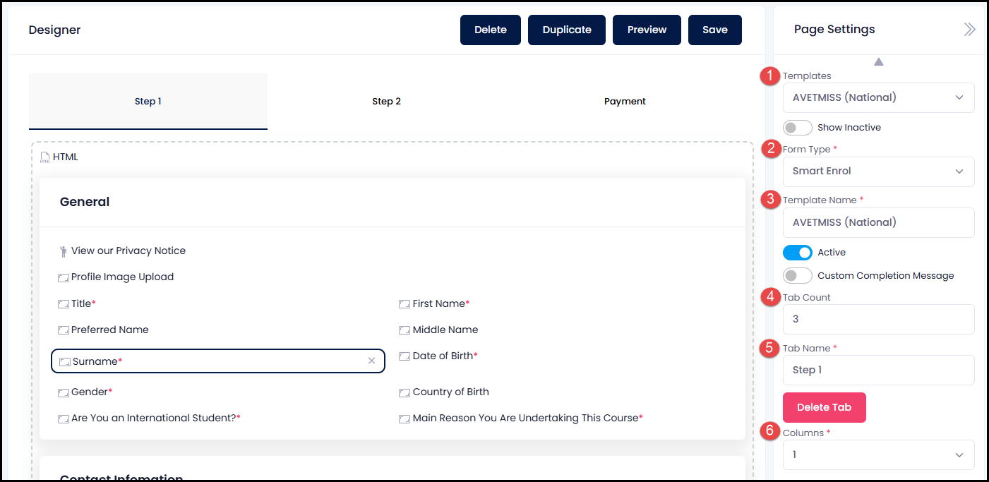
- Templates - A dropdown menu that shows a list of existing form templates
- Show Inactive toggle - When enabled, displays templates that have been set to inactive. (see 3.a)
- Form Type - A dropdown menu with two options:
- Smart Enrol - Used to create and manage enrolment forms.
- Contact Form - Used to create waitlist forms. See How to Join a Waitlist? (via Smart Enrol Form or External Calendar) for more information.
- Template Name - The name entered here will be displayed in the Templates list (#1).
- Active toggle - Indicates whether the template is active. When set to inactive, the template cannot be used and is hidden from system lists by default.
- Custom Completion Message - Allows you to enter a personalised message that will be displayed to the student after successfully submitting the form.
- Tab Count - Determines the number of tabs displayed on the form.
- Tab Name - Determines the name displayed for each tab (e.g. Student Information, Payment).
- Columns - Determines the number of columns displayed within the form.
4. Control Settings
When you drag a Field into the Designer, Control Settings for the Field are shown under Page Settings.
- You may change the size of the Control from Full to Half. 'Half' size will occupy only 50% of its column.
- Label will be filled-in automatically depending on what you select from the Field Dropdown Menu (d).
- For other controls, the Label should be entered by the user.
- Switching to Custom Field will make the Field Dropdown List show all Contact-related fields. You may refer to this tutorial: How to Use Custom Fields.
- The Field Dropdown Menu works hand in hand with the Label (b). Select an item from the dropdown list and it will automatically fill-in the Label. i.e. If Field is "Surname", Label will show "Surname".
- The "Required" switch ensures that users must fill in this field before they can submit the form. It prevents the form from being submitted if the textbox is left empty, prompting users to provide the necessary information.
How the four sections work together:
When you drag a Field into the Designer, Control
Settings for the Field are shown under Page Settings.
- You may change the size of the Control from Full to Half. 'Half' size will occupy only 50% of its column.
- Label will be filled-in automatically depending on what you select from the Field Dropdown Menu (d).
- For other controls, the Label should be entered by the user.
- The Field Dropdown Menu works hand in hand with the Label (b). Select an item from the dropdown list and it will automatically fill-in the Label. i.e. If Field is "Surname", Label will show "Surname".
- The "Required" switch ensures
that users must fill in this field before they can submit the form. It prevents
the form from being submitted if the textbox is left empty, prompting users to
provide the necessary information.

Step Tutorial
How to Create a Form
For this example, let's create a Waitlist Form where
interested contacts can enter their information and join the Waitlist for a
Student Group.
1. From the dashboard menu, go to Administration then click Form Creator.
2. Setup a Template. This must be done
before you can use the controls on the left to add objects to the form.
- Templates - Select new template or an existing one
- Template Name - Add a template name
- Columns - Select the number of Columns (1
minimum, 3 maximum)
Once the Page Settings is setup, you may save your form
anytime during the editing process by clicking the Save button in
the Designer section. We recommend you save your form
at regular intervals to minimise data loss.
Preview button will become available after you save
the form for the first time.
3. Drag a Card into the designer section.
Pro tip: You may drag another card inside the first card so
that the outer card is the whole form and the ones inside are the different
sections of the form
4. Setup the Control settings. The Header text
is what will appear on top of the section. See image below where "Waitlist
Form" is used as the Header text.
5. Drag a Field from the Controls section
to the Designer.
6. Click on the Field that you just dragged in and select
the "First Name" from the Field dropdown menu under
the Control Settings.
Selecting a Field from the dropdown list will automatically
fill in the Label with the appropriate text according to your selected Field.
7. Depending on your organisational needs, you may add more
fields to gain more knowledge about people who are interested to join your
program/s. In addition to the First Name and Surname, we also added Email,
Date of Birth, Address Fields and an Image Upload to
ask for proof of identity from the interested party.
If the field is set to Required, an asterisk (*) will be added after label.
8. Optionally, you may also add a Card with
a Privacy Notice using HTML Text to assure the interested
party that their data is used solely for tracking interest in your program.
Once done, click Save.
NOTE: Clicking Preview will open a new tab
displaying the form you have created.
And that’s how to use the form creator in the SMS!
Congratulations on completing this tutorial. We hope this
has been helpful to you and your organisation. For any questions or concerns
regarding this function, please reach out to the contact support via email.